 When writing Chinese characters, small differences sometimes matter, but sometimes they don’t. Figuring out which details to pay attention to is made even harder by character variants and font differences!
For example, when I first started learning Chinese, I accidentally used a Japanese font on my flashcards. This was easy to fix once I realised what was happening, but I lost several points on exams before I realised something was wrong!
Tune in to the Hacking Chinese Podcast to listen to the related episode (#207):
Available on Apple Podcasts, Google Podcast, Overcast, Spotify, YouTube and many other platforms!
I was only able to sort this out when my teacher highlighted the issue. Here’s what my flashcard looked like for the character 直 (left), including in similar compounds like 值 and 真, next to what it should look like (right).
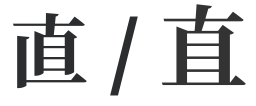
Here are more examples of the same character written according to different standards. This time, the difference is between mainland China and Taiwan standards (in that order), rather than Japanese.

Can you spot where these characters are different? There are two major differences for each character! You can see the difference highlighted further down in this article.
Chinese character variants and font differences for language learners
In this article, I will discuss character variation and font differences. In essence, these are different ways of writing or displaying the same character. Even though they look different, they are still the same character. It’s as if they are wearing different clothes, as I put it in Skritter’s character course.
The goal here is not to cover every single case, but rather to make you aware of this phenomenon and show you enough examples so that you understand the concepts involved. This will not make the challenge go away, but it will be less confusing!
Note that this is not the same as simplified and traditional characters. None of the characters above are listed in the documents describing the character simplification process. Instead, they are parallel variants of the same character, where one version is preferred in different regions. How they are displayed on computers often depends on the font you use, not what you actually type, which is not true for simplified and traditional characters.
So far, I’ve mentioned mainland China, Japan and Taiwan, but Hong Kong, Korea and Vietnam also use characters and often have different standards as well.
The same characters written differently, not different characters
Remember that these are the same characters, written differently, not different characters that look similar. In handwritten Chinese, which variant you use matters little, and no one will misunderstand you if you write the “wrong” version. Most people will not even notice. Most people do not write exactly like the standard in their respective regions either.
However, when using phones and computers, you will come across characters that are different from what you have learnt, and knowing about this phenomenon can be helpful.
Each time I teach a beginner course in Chinese, I get questions about different fonts and computer characters that don’t look like the characters in the textbook or those I write on the board.
Character variation closer to home
To better understand character variation in Chinese, let’s start by looking at two examples from English:
- g vs. ɡ
- a vs. ɑ
The former letter variant is common in print and digital texts, but the latter is much more common in handwritten texts. They are the same letters, though.
Most people might not even notice which one you use! So, from a practical perspective, they are the same and both are recognised as the same letter, even though they look different. They are the same at the core, they’re just wearing different clothes.
If an adult encountered the Latin alphabet for the first time, they could be forgiven for thinking that “a” and “ɑ” are not very similar. Arguably, the latter is closer to “o” than “a”. There’s also “A”, which is again the same letter but written quite differently. While not identical in function, it’s still the same letter.
When writing by hand in English then, some strokes are important, but others are not.
Allography and character variants
This is called allography and can be confusing when learning Chinese characters. The same character can look slightly different depending on what region you’re in, what fonts you have installed and what fonts the publisher decided to use.
These differences are sometimes so big that they look like different characters, just like “a” and “A” don’t look very similar to the untrained eye
The problem is that you can’t know this just by looking at the characters, because there are also many examples where small details make the difference between two different characters with their own pronunciation and meaning, as in 已 (yǐ) vs. 己 (jǐ).
To explain this in this article, I have divided character variation into two categories:
- Regional font differences
- Regionally preferred variants
These are technically not different things, but they work differently on your computer or phone, so it’s worth discussing them separately.
Regional font differences in Chinese
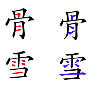
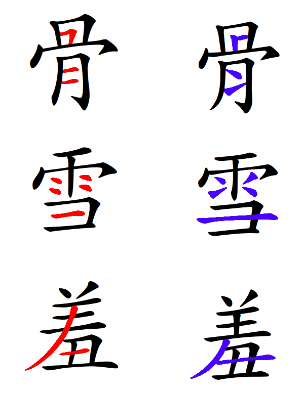
The first group contains characters that are identical from a code perspective (they have the same code point in Unicode). This means they can’t be displayed differently using the same font. If you take the top character from the image below, 骨, you can only ever get one of the variants within the same text, assuming you use the same font.
Here are the examples we looked at earlier, now bigger and with the differences highlighted. Left/red is the standard in mainland China, and right/blue is the standard in Taiwan:
The fonts used in this picture are 方正楷体简体 and 教育部標準楷書.
While no one will misunderstand what you write if you use the “wrong” version, either in print or handwriting, these differences can confuse and cost you points on exams, as they did for me!
Normal Chinese font variation
Even though this is not the topic of this article, I feel I need to point out that fonts look different in many ways beyond the differences I’m talking about here, just like fonts do in English. Two types of fonts are particularly useful to be aware of as a student:
- 明体 (míngtǐ), is the most common type of font used in both printed and digital texts today. It’s sometimes also called 宋体 (sòngtǐ). You can recognise it by the marked contrast between horizontal and vertical
lines, and the small triangles at the end of horizontal strokes. - 楷体 (kǎitǐ), or “regular script,” is more similar to handwriting and is the second most common style, except in Chinese textbooks where it’s completely dominant. Your textbook almost certainly uses this type of font. It’s easy to recognise because strokes have variable thicknesses.
Here’s the motto of Hacking Chinese written with both types of fonts (明体 at the top, 楷体 at the bottom), all in traditional Chinese:

For more about Chinese fonts, including their history, check this video from Skritter:
Regionally preferred variants of Chinese characters
Now that we have looked at font differences, let’s move on to the second group. Here, we have characters with several variants that are preferred in different places. Here’s an example:
- 户 (preferred in mainland China)
- 戶 (preferred in Taiwan)
- 戸 (preferred in Japan)
Superficially, this looks like the same issue as we’ve already discussed, but it’s not. The difference is that these are different from a code perspective (they have different code points), so which one is displayed is not only a font issue. Since they are different, they can be displayed differently even with the same font, although some fonts merge some of them.
Here are some examples of characters for which the preferred variant is different (again, mainland China on the left, Taiwan on the right):
- 户 and 戶
- 录 and 彔
- 没 and 沒
- 换 and 換
- 黄 and 黃
- 奥 and 奧
- 别 and 別
- 刹 and 剎
- 冲 and 沖
- 羡 and 羨
- 抛 and 拋
- 吴 and 吳
To summarise, these can be displayed differently if the font is designed to do so. If some characters listed above look the same to you, it means that the device you’re reading this article on is using a font where they are the same, instead of the one I use, which will render them differently. On my computer, they all look different.
This is different from the font variations we talked about earlier, which cannot be displayed differently within the same font, as they share the same code point.
Rather confusingly, some of the variants that have different code points, such as 户 and 戶, appear in compounds, such as 房, that don’t have two parallel versions, so which one you get is then again entirely up to the font you’re using.
More Chinese character variants
Chinese characters have been used by a myriad of people over thousands of years in a vast geographical area. This means that there are often not just one or two variants, but dozens. Here’s the search result in this dictionary of Chinese character variants for the first example I used in the introduction of this article: 直
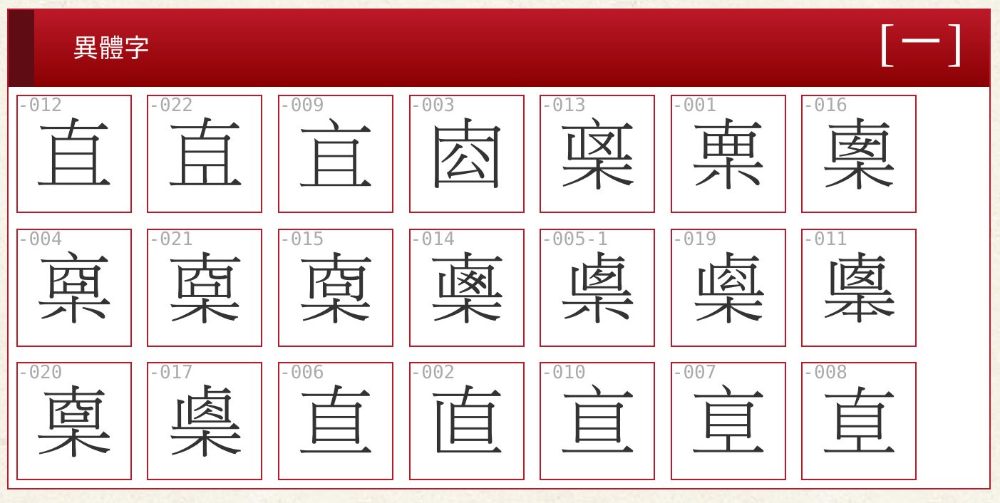
However, most of these are not used often or at all in a modern context.
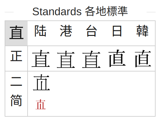
This tool can come in handy if you want to check standards across different regions quickly. It contains a lot of information about characters in general, but in the bottom right, you’ll find this information (again for 直):
Conclusion
This article was meant to help you understand why some characters may be displayed differently depending on what fonts you use or where a character was printed. To verify that you’re using the right font, you can refer to this companion article: How to verify that you use the right Chinese font
I realise that this article probably created more questions than it answered, but that’s just the nature of the Chinese writing system. There rarely are simple questions with straightforward answers that don’t turn out to be rabbit holes.
If you want to know more about how Chinese characters and fonts work, here is a short reading list:
- What’s the Difference between Simplified & Traditional Chinese, and are they Separate in Unicode?
- Unicode Chinese and Japanese FAQ
- Variant Chinese characters
- Han Unification
Editor’s note: This article, originally published in 2015, was rewritten from scratch and massively updated in July, 2024.

5 comments
You sure the red one on the left is mainland? My wife from Taiwan seems to disagree.
Which characters in particular do you refer to? The ones on the right use the standard Kaishu fonts issued by the Ministry of Education (Taiwan). This may or may not reflect the way your wife (or any other individual) actually writes.
What exactly do you mean by code point?
Does the preference for certain variants occur between regions inside Mainland China? Or maybe web vs printed versions?
The most frustrating part is that sometimes the difference between variants is bigger than the difference between different words 😅
example
裏 & 裡 – variants of the same traditional character
力 & 为 – totally different words, both simplified characters
And how these different variants survived coexisting as traditional forms?
A code point is an integer value that refers to a specific character in Unicode. If two variants share the same code point, they are effectively the same from the computers point of view. If the code point is different, it means that the characters can be represented differently (but it depends on the font). More here if you’re interested!
The examples you brought up have different code points (otherwise they couldn’t be displayed as different characters without resorting to using pictures). And yes, this can be a bit frustrating, but you’ll get used to it! If you look at your first example, you can see that they are actually made up of the same components, but stacked vertically in one case. There are in fact a whole series of such variants.
I’m not sure what you mean with your follow-up question about traditional characters? In your specific case, one is standard in Hong Kong, the other in Taiwan, but they have probably coexisted for a long time, different government institutions just chose different variants for their respective standards, for some reason!